15 B Roll Ideas for UGC Ads That Create Tests
Get b roll ideas for ugc ads that create sharper hooks, clearer proof, and more meaningful creative tests across Meta and TikTok without bloated shoots.
By Scrolling Studio · · 7 min read
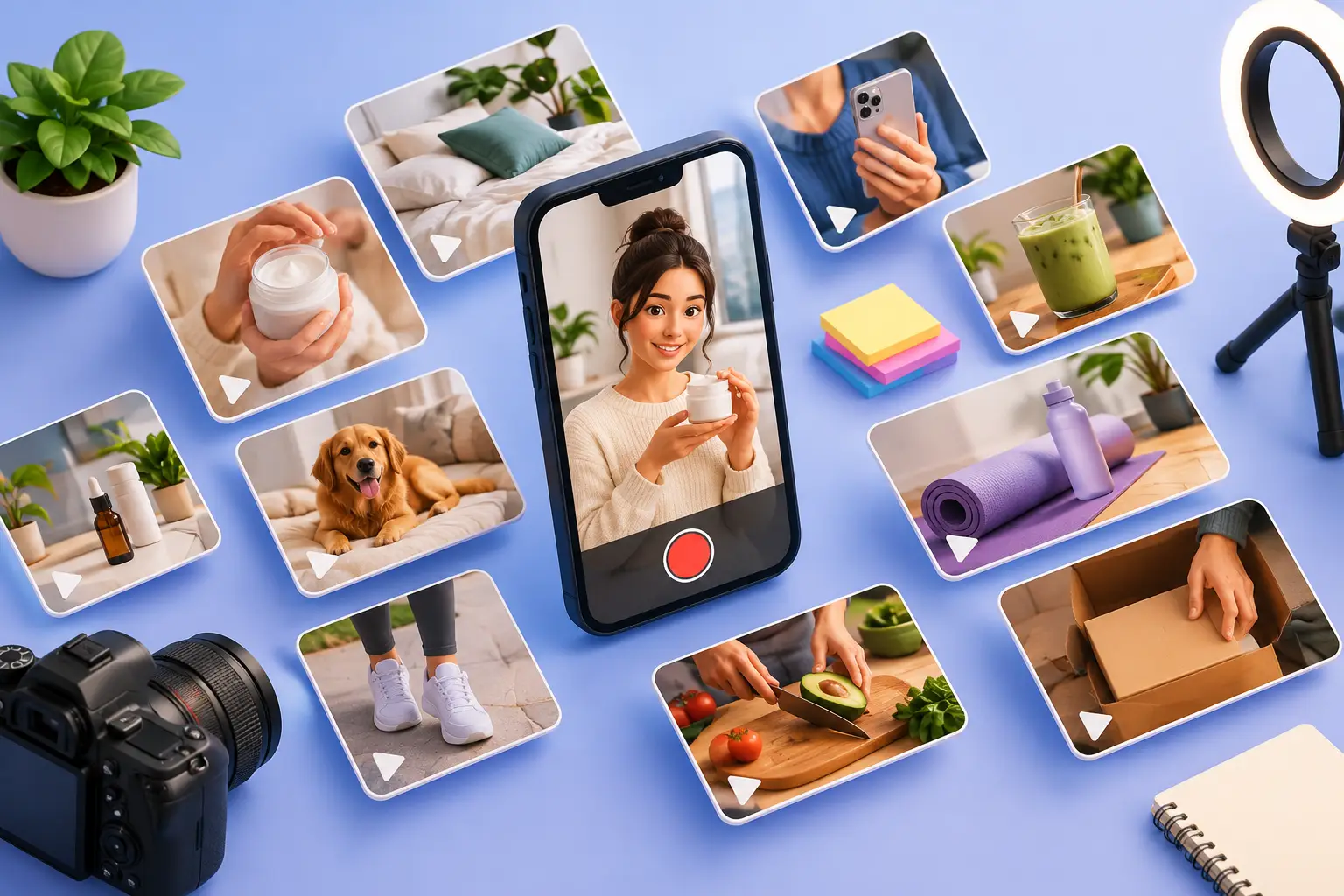
The best b roll ideas for ugc ads are not filler between talking-head lines. They are conversion assets. A close-up of a stubborn stain lifting, a thumb moving through an app screen, or a package landing on a doorstep can make a claim easier to believe and give an editor a cleaner way to reset attention before the scroll wins.
Most brands do not have a shortage of footage. They have a shortage of purposeful footage. The same beauty shelf pan, product unboxing, and smiling reaction appear in every variation, so the ad looks different without testing a different persuasion angle. That is creative volume, not creative learning.
A better approach is to plan B-roll around the job each shot needs to do: establish the problem, demonstrate the mechanism, prove the result, reduce buying friction, or make the outcome feel desirable. That gives paid social teams more than polished edits. It gives them variables worth testing.
What B-Roll Should Do in a UGC Ad
UGC works because it can feel like a person sharing a useful discovery, not a brand making a formal announcement. B-roll supports that feeling when it looks specific, handheld, and connected to the creator's actual routine. It fails when it becomes generic lifestyle wallpaper.
For performance creative, every cut should answer a viewer question. What is the problem? How does this work? Will it fit my life? Can I trust the result? Is buying it annoying or risky? A strong script may answer those questions verbally, but visual proof makes the answer faster to process, especially with sound off.
The trade-off is pace. A product demo needs enough screen time to be understood, while a TikTok-style ad still needs pattern interrupts. Do not cut every half-second simply because the platform is fast. Cut when the next image adds information, tension, or proof.
15 B Roll Ideas for UGC Ads
1. Show the problem before the product
Start with the annoyance in its natural habitat: a cluttered supplement drawer, frizzy hair in a bathroom mirror, an overflowing inbox, or a pet scratching at a couch. The less staged it feels, the more the opening can earn attention. This is especially useful when your hook names a pain point and needs an immediate visual receipt.
2. Capture the first-use moment
Film the cap twisting off, the app downloading, the box opening, or the tool coming out of the package. First-use footage creates forward motion. It also works well under lines like, “I did not expect this to be so easy,” because the viewer can see the moment of discovery.
3. Use a close-up to show the mechanism
If the product has a feature, show it operating. Zoom into the texture, button, attachment, dashboard, ingredient label, or setup process. Claims such as “targets breakage” or “saves me time” are abstract until the viewer sees what makes them plausible.
4. Film the before state honestly
Before-and-after creative can perform, but only when the before is credible. Show the wrinkled shirt, rough skin texture, disorganized counter, or slow workflow without overproducing the struggle. Unrealistically dramatic befores may increase skepticism and create compliance issues depending on the category.
5. Let the creator demonstrate one clear action
One action per shot is usually enough: apply, spray, swipe, pour, scan, fold, or tap. Keep the camera close enough that the action is legible on a phone screen. If viewers cannot tell what happened in the first second, the footage will not carry the line it is meant to support.
6. Add a real-time result
Show the coffee dissolving, the makeup blending, the app generating an output, or the drawer closing neatly. Real-time proof is more persuasive than a jump cut when the result happens quickly. It lowers the sense that the edit is doing all the work.
7. Build a routine sequence
Show where the product lives in the day: next to the toothbrush, in a gym bag, on a desk before work, or by the front door. Routine shots answer a silent objection: “Would I actually use this?” They are particularly valuable for replenishable products, wellness offers, and apps trying to become habitual.
8. Include the inconvenient alternative
A side-by-side is not always necessary. Sometimes one quick shot of the old workaround does the job: multiple tabs open, a pile of cleaning products, an expensive salon receipt, or a tangled charging cable. The contrast gives your solution context without requiring a long explanation.
9. Film an unprompted reaction
A small laugh, a double take, a “wait, look at this,” or a creator calling someone over can break the polish of an ad in a useful way. Keep it restrained. Overacted surprise makes a UGC ad feel like a commercial wearing casual clothes.
10. Make social proof visual
Instead of reading a review over a static screenshot, show a creator scrolling through ratings, pulling up a text from a friend, or pointing to a repeat order. For apps, show relevant in-product activity rather than a vague five-star graphic. The proof needs to be recognizable in under a second.
11. Put the product in the use environment
A travel bag, shower shelf, car console, office desk, stroller pocket, or kitchen counter says more than a studio tabletop. Environment tells the viewer who the product is for and when it enters the routine. It can also create separate audience angles from the same core product.
12. Show the size, scale, or quantity
People hesitate when they cannot judge dimensions, servings, coverage, or value. Film the product in a hand, next to a common object, filling a glass, or covering a real surface. This is practical B-roll, but it can reduce purchase friction more effectively than another beauty shot.
13. Capture delivery and setup
For ecommerce, the package arriving and the product being ready quickly can reinforce convenience. For software or apps, show onboarding, a key input, and the useful output. Do not pretend setup takes one tap if it does not. A clear, honest sequence filters out bad-fit buyers and supports better downstream performance.
14. Create a sensory proof shot
Texture, sound, motion, and transformation make certain categories easier to feel through a screen. Think serum spreading, fabric stretching, foam forming, food breaking apart, or a satisfying click into place. Sensory footage is not just aesthetic. It can make a product benefit memorable when words alone feel interchangeable.
15. End with ownership, not a logo
A final shot of the creator using the product naturally, placing it back in their routine, or showing the finished outcome often works better than an extended pack shot. The product should still be identifiable, but the closing image should make ownership feel like the logical next step.
Turn B-Roll Into Meaningful Creative Variations
The fastest way to waste a production cycle is to collect all 15 shots and use them randomly across three edits. Build each execution around a distinct hypothesis instead.
One ad can lead with the problem and use messy-before footage, the old workaround, and a real-time fix. A second can lead with convenience and show delivery, setup, routine placement, and an easy action. A third can lead with results and focus on close-up mechanism, sensory proof, and the finished outcome. The product stays the same, but the reason to care changes.
That distinction matters when results come back. If one variation wins, the team can identify whether the audience responded to pain relief, ease, visual transformation, or social proof. If all three use the same B-roll sequence with slightly different voiceover, the test tells you far less.
Plan footage in modules during briefing. Match every spoken claim to at least one visual proof option, then capture a few flexible inserts that can change pacing: hands reaching for the product, a close-up of the label, a mirror glance, an app tap, or a completed result. Give editors choices without asking them to invent a story from disconnected clips.
For brands running a steady paid social calendar, this is where a disciplined production system wins. Scrolling Studio develops distinct creative executions rather than superficial reskins, so each new asset has a clearer role in the test plan. No monthly retainer. No long contract. No agency calls.
A Simple Shot Brief for Creators
Do not send creators a vague request for “lots of B-roll.” That usually produces wide shots, repeated unboxings, and footage no editor can use. Specify the claim, the action, the setting, the framing, and the duration.
For example: “Show one pump of the cleanser on wet hands, tight framing, natural bathroom light, hold the lather for two seconds.” Or: “Record a screen capture of creating a weekly plan, then show the finished plan for three seconds.” The detail protects quality while leaving room for the creator's natural delivery.
Ask for clean versions without spoken audio when possible. Keep the product label visible in several shots, but do not force it into every frame. Capture vertical footage with headroom for captions and platform UI. Most important, get multiple takes of the proof moments, not just the opening line. Editors can work around an imperfect reaction. They cannot manufacture a credible demonstration.
The next time an ad starts to fatigue, do not default to a new script alone. Change what the viewer sees when the claim lands. The right B-roll can turn the same product truth into a sharper hook, a clearer proof point, and a test worth running.